

Color inspiration pops up just about everywhere.... something about this crisp contrast of spicy orange and cool, gray blue feels modern and energized. How does that translate into actual hues? Well, let's dive in....
Benjamin Moore Wyeth Blue is a perennial classic shade that looks at home in a 19th century interior or a 21st century exterior. The magic of this tone is that it is gray or green or blue depending on the time of day or amount of light.

Spicy, spicy, spicy. Benjamin Moore Festive Orange has all of the warmth and intensity of a red, but without all of the the bossiness. Red is harder to partner with other tones, but orange can activate other colors without dominating them.

The perfect white always sets off all colors around it. White Dove by Benjamin Moore is the perfect way to activate all the surrounding colors.
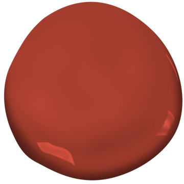
Benjamin Moore's Paper Lantern is a red with such heat behind it that it feels grounded and connected to the other colors in the palette.
The overall palette is cohesive and energized and completely inspiring. We are already dreaming up ways to translate this palette into the design for a wonderful interior space!